Hinweis
Zum Ende gehen, um den vollständigen Beispielcode herunterzuladen oder um dieses Beispiel über JupyterLite oder Binder in Ihrem Browser auszuführen.
Visualisierung der Aktienmarktstruktur#
Dieses Beispiel verwendet mehrere unüberwachte Lerntechniken, um die Aktienmarktstruktur aus Variationen historischer Kurse zu extrahieren.
Die von uns verwendete Größe ist die tägliche Variation des Kurses: Verbundene Kurse neigen dazu, sich im Laufe eines Tages relativ zueinander zu schwanken.
# Authors: The scikit-learn developers
# SPDX-License-Identifier: BSD-3-Clause
Daten aus dem Internet abrufen#
Die Daten stammen aus den Jahren 2003-2008. Dies ist eine relativ ruhige Zeit: nicht zu weit zurück, sodass wir noch High-Tech-Firmen haben, und vor dem Crash von 2008. Diese Art von historischen Daten kann über APIs wie data.nasdaq.com und alphavantage.co bezogen werden.
import sys

import numpy as np
import pandas as pd

symbol_dict = {
    "TOT": "Total",
    "XOM": "Exxon",
    "CVX": "Chevron",
    "COP": "ConocoPhillips",
    "VLO": "Valero Energy",
    "MSFT": "Microsoft",
    "IBM": "IBM",
    "TWX": "Time Warner",
    "CMCSA": "Comcast",
    "CVC": "Cablevision",
    "YHOO": "Yahoo",
    "DELL": "Dell",
    "HPQ": "HP",
    "AMZN": "Amazon",
    "TM": "Toyota",
    "CAJ": "Canon",
    "SNE": "Sony",
    "F": "Ford",
    "HMC": "Honda",
    "NAV": "Navistar",
    "NOC": "Northrop Grumman",
    "BA": "Boeing",
    "KO": "Coca Cola",
    "MMM": "3M",
    "MCD": "McDonald's",
    "PEP": "Pepsi",
    "K": "Kellogg",
    "UN": "Unilever",
    "MAR": "Marriott",
    "PG": "Procter Gamble",
    "CL": "Colgate-Palmolive",
    "GE": "General Electrics",
    "WFC": "Wells Fargo",
    "JPM": "JPMorgan Chase",
    "AIG": "AIG",
    "AXP": "American express",
    "BAC": "Bank of America",
    "GS": "Goldman Sachs",
    "AAPL": "Apple",
    "SAP": "SAP",
    "CSCO": "Cisco",
    "TXN": "Texas Instruments",
    "XRX": "Xerox",
    "WMT": "Wal-Mart",
    "HD": "Home Depot",
    "GSK": "GlaxoSmithKline",
    "PFE": "Pfizer",
    "SNY": "Sanofi-Aventis",
    "NVS": "Novartis",
    "KMB": "Kimberly-Clark",
    "R": "Ryder",
    "GD": "General Dynamics",
    "RTN": "Raytheon",
    "CVS": "CVS",
    "CAT": "Caterpillar",
    "DD": "DuPont de Nemours",
}


symbols, names = np.array(sorted(symbol_dict.items())).T

quotes = []

for symbol in symbols:
    print("Fetching quote history for %r" % symbol, file=sys.stderr)
    url = (
        "https://raw.githubusercontent.com/scikit-learn/examples-data/"
        "master/financial-data/{}.csv"
    )
    quotes.append(pd.read_csv(url.format(symbol)))

close_prices = np.vstack([q["close"] for q in quotes])
open_prices = np.vstack([q["open"] for q in quotes])

# The daily variations of the quotes are what carry the most information
variation = close_prices - open_prices
Fetching quote history for np.str_('AAPL')
Fetching quote history for np.str_('AIG')
Fetching quote history for np.str_('AMZN')
Fetching quote history for np.str_('AXP')
Fetching quote history for np.str_('BA')
Fetching quote history for np.str_('BAC')
Fetching quote history for np.str_('CAJ')
Fetching quote history for np.str_('CAT')
Fetching quote history for np.str_('CL')
Fetching quote history for np.str_('CMCSA')
Fetching quote history for np.str_('COP')
Fetching quote history for np.str_('CSCO')
Fetching quote history for np.str_('CVC')
Fetching quote history for np.str_('CVS')
Fetching quote history for np.str_('CVX')
Fetching quote history for np.str_('DD')
Fetching quote history for np.str_('DELL')
Fetching quote history for np.str_('F')
Fetching quote history for np.str_('GD')
Fetching quote history for np.str_('GE')
Fetching quote history for np.str_('GS')
Fetching quote history for np.str_('GSK')
Fetching quote history for np.str_('HD')
Fetching quote history for np.str_('HMC')
Fetching quote history for np.str_('HPQ')
Fetching quote history for np.str_('IBM')
Fetching quote history for np.str_('JPM')
Fetching quote history for np.str_('K')
Fetching quote history for np.str_('KMB')
Fetching quote history for np.str_('KO')
Fetching quote history for np.str_('MAR')
Fetching quote history for np.str_('MCD')
Fetching quote history for np.str_('MMM')
Fetching quote history for np.str_('MSFT')
Fetching quote history for np.str_('NAV')
Fetching quote history for np.str_('NOC')
Fetching quote history for np.str_('NVS')
Fetching quote history for np.str_('PEP')
Fetching quote history for np.str_('PFE')
Fetching quote history for np.str_('PG')
Fetching quote history for np.str_('R')
Fetching quote history for np.str_('RTN')
Fetching quote history for np.str_('SAP')
Fetching quote history for np.str_('SNE')
Fetching quote history for np.str_('SNY')
Fetching quote history for np.str_('TM')
Fetching quote history for np.str_('TOT')
Fetching quote history for np.str_('TWX')
Fetching quote history for np.str_('TXN')
Fetching quote history for np.str_('UN')
Fetching quote history for np.str_('VLO')
Fetching quote history for np.str_('WFC')
Fetching quote history for np.str_('WMT')
Fetching quote history for np.str_('XOM')
Fetching quote history for np.str_('XRX')
Fetching quote history for np.str_('YHOO')
Lernen einer Graphstruktur#
Wir verwenden die Schätzung der spärlichen inversen Kovarianz, um festzustellen, welche Kurse bedingt durch die anderen korreliert sind. Insbesondere liefert die spärliche inverse Kovarianz einen Graphen, d. h. eine Liste von Verbindungen. Für jedes Symbol sind die verbundenen Symbole diejenigen, die zur Erklärung seiner Schwankungen nützlich sind.
from sklearn import covariance

alphas = np.logspace(-1.5, 1, num=10)
edge_model = covariance.GraphicalLassoCV(alphas=alphas)

# standardize the time series: using correlations rather than covariance
# former is more efficient for structure recovery
X = variation.copy().T
X /= X.std(axis=0)
edge_model.fit(X)
Clustering mit Affinitätsausbreitung#
Wir verwenden Clustering, um ähnlich verhaltende Kurse zu gruppieren. Hier verwenden wir unter den verschiedenen Clustering-Techniken, die in scikit-learn verfügbar sind, Affinity Propagation, da es keine Cluster gleicher Größe erzwingt und die Anzahl der Cluster automatisch aus den Daten wählen kann.
Beachten Sie, dass dies eine andere Indikation liefert als der Graph, da der Graph bedingte Beziehungen zwischen Variablen widerspiegelt, während das Clustering marginale Eigenschaften widerspiegelt: Zusammen geclusterte Variablen können als gleichartige Auswirkungen auf Ebene des gesamten Aktienmarktes betrachtet werden.
from sklearn import cluster

_, labels = cluster.affinity_propagation(edge_model.covariance_, random_state=0)
n_labels = labels.max()

for i in range(n_labels + 1):
    print(f"Cluster {i + 1}: {', '.join(names[labels == i])}")
Cluster 1: Apple, Amazon, Yahoo
Cluster 2: Comcast, Cablevision, Time Warner
Cluster 3: ConocoPhillips, Chevron, Total, Valero Energy, Exxon
Cluster 4: Cisco, Dell, HP, IBM, Microsoft, SAP, Texas Instruments
Cluster 5: Boeing, General Dynamics, Northrop Grumman, Raytheon
Cluster 6: AIG, American express, Bank of America, Caterpillar, CVS, DuPont de Nemours, Ford, General Electrics, Goldman Sachs, Home Depot, JPMorgan Chase, Marriott, McDonald's, 3M, Ryder, Wells Fargo, Wal-Mart
Cluster 7: GlaxoSmithKline, Novartis, Pfizer, Sanofi-Aventis, Unilever
Cluster 8: Kellogg, Coca Cola, Pepsi
Cluster 9: Colgate-Palmolive, Kimberly-Clark, Procter Gamble
Cluster 10: Canon, Honda, Navistar, Sony, Toyota, Xerox
Einbettung im 2D-Raum#
Zu Visualisierungszwecken müssen wir die verschiedenen Symbole auf einer 2D-Leinwand anordnen. Dazu verwenden wir Manifold Learning-Techniken, um eine 2D-Einbettung abzurufen. Wir verwenden einen dichten eigen_solver, um die Reproduzierbarkeit zu gewährleisten (arpack wird mit den von uns nicht kontrollierten Zufallsvektoren initialisiert). Darüber hinaus verwenden wir eine große Anzahl von Nachbarn, um die großräumige Struktur zu erfassen.
# Finding a low-dimension embedding for visualization: find the best position of
# the nodes (the stocks) on a 2D plane

from sklearn import manifold

node_position_model = manifold.LocallyLinearEmbedding(
    n_components=2, eigen_solver="dense", n_neighbors=6
)

embedding = node_position_model.fit_transform(X.T).T
Visualisierung#
Die Ausgabe der 3 Modelle wird in einem 2D-Graphen kombiniert, bei dem Knoten die Aktien und Kanten die Verbindungen (partielle Korrelationen) darstellen.
Cluster-Labels werden zur Bestimmung der Farbe der Knoten verwendet.
Das spärliche Kovarianzmodell wird verwendet, um die Stärke der Kanten anzuzeigen.
Die 2D-Einbettung wird zur Positionierung der Knoten in der Ebene verwendet.
Dieses Beispiel enthält eine beträchtliche Menge an Visualisierungs-bezogenem Code, da die Visualisierung hier entscheidend ist, um den Graphen anzuzeigen. Eine der Herausforderungen besteht darin, die Labels so zu positionieren, dass Überlappungen minimiert werden. Dazu verwenden wir eine Heuristik, die auf der Richtung des nächsten Nachbarn entlang jeder Achse basiert.
import matplotlib.pyplot as plt
from matplotlib.collections import LineCollection

plt.figure(1, facecolor="w", figsize=(10, 8))
plt.clf()
ax = plt.axes([0.0, 0.0, 1.0, 1.0])
plt.axis("off")

# Plot the graph of partial correlations
partial_correlations = edge_model.precision_.copy()
d = 1 / np.sqrt(np.diag(partial_correlations))
partial_correlations *= d
partial_correlations *= d[:, np.newaxis]
non_zero = np.abs(np.triu(partial_correlations, k=1)) > 0.02

# Plot the nodes using the coordinates of our embedding
plt.scatter(
    embedding[0], embedding[1], s=100 * d**2, c=labels, cmap=plt.cm.nipy_spectral
)

# Plot the edges
start_idx, end_idx = non_zero.nonzero()
# a sequence of (*line0*, *line1*, *line2*), where::
#            linen = (x0, y0), (x1, y1), ... (xm, ym)
segments = [
    [embedding[:, start], embedding[:, stop]] for start, stop in zip(start_idx, end_idx)
]
values = np.abs(partial_correlations[non_zero])
lc = LineCollection(
    segments, zorder=0, cmap=plt.cm.hot_r, norm=plt.Normalize(0, 0.7 * values.max())
)
lc.set_array(values)
lc.set_linewidths(15 * values)
ax.add_collection(lc)

# Add a label to each node. The challenge here is that we want to
# position the labels to avoid overlap with other labels
for index, (name, label, (x, y)) in enumerate(zip(names, labels, embedding.T)):
    dx = x - embedding[0]
    dx[index] = 1
    dy = y - embedding[1]
    dy[index] = 1
    this_dx = dx[np.argmin(np.abs(dy))]
    this_dy = dy[np.argmin(np.abs(dx))]
    if this_dx > 0:
        horizontalalignment = "left"
        x = x + 0.002
    else:
        horizontalalignment = "right"
        x = x - 0.002
    if this_dy > 0:
        verticalalignment = "bottom"
        y = y + 0.002
    else:
        verticalalignment = "top"
        y = y - 0.002
    plt.text(
        x,
        y,
        name,
        size=10,
        horizontalalignment=horizontalalignment,
        verticalalignment=verticalalignment,
        bbox=dict(
            facecolor="w",
            edgecolor=plt.cm.nipy_spectral(label / float(n_labels)),
            alpha=0.6,
        ),
    )

plt.xlim(
    embedding[0].min() - 0.15 * np.ptp(embedding[0]),
    embedding[0].max() + 0.10 * np.ptp(embedding[0]),
)
plt.ylim(
    embedding[1].min() - 0.03 * np.ptp(embedding[1]),
    embedding[1].max() + 0.03 * np.ptp(embedding[1]),
)

plt.show()

Gesamtlaufzeit des Skripts: (0 Minuten 4,902 Sekunden)
Verwandte Beispiele
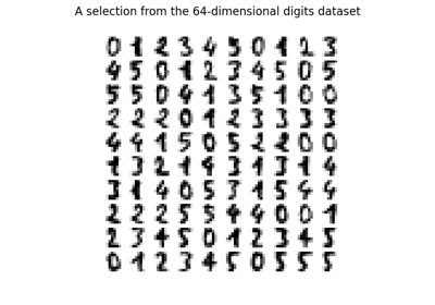
Manifold Learning auf handschriftlichen Ziffern: Locally Linear Embedding, Isomap…
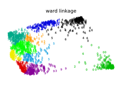
Verschiedenes Agglomeratives Clustering auf einer 2D-Einbettung von Ziffern
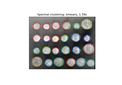
Segmentierung des Bildes von griechischen Münzen in Regionen